Product Type
SaaS Platform · Admin Dashboard · Analytics
Audit Type
UX Friction Audit · Silent Bug Detection · Flow Analysis
Background
The client operates a data-driven Analytics SaaS platform used by product and operations teams to monitor performance metrics, trends, and reports through a complex admin dashboard.
Despite strong core functionality, the product team observed:
- Slower user adoption of advanced features
- Increased support queries around navigation and reporting
- Drop-offs during first-time dashboard usage
The challenge was not visible crashes or errors — but silent UX friction affecting usability and confidence.
Objective
The goal of this audit was to:
- Identify hidden UX issues impacting daily usage
- Uncover non-obvious bugs and flow inconsistencies
- Improve clarity, navigation efficiency, and data comprehension
- Reduce cognitive load for both new and returning users
Our Approach
We conducted a deep, manual UX and behavior-driven audit, approaching the product as a first-time but critical user.
Key methods used:
- Real-user simulation across common admin workflows
- Task-based navigation testing (reports, filters, exports)
- UX friction mapping across dashboard components
- Edge-case testing on data states (empty, partial, overloaded)
- Visual hierarchy and interaction consistency review
No automation. No assumptions. Only real product behavior.
Key Findings
1. Navigation Friction
- Important dashboard actions were visually buried
- Similar labels triggered different behaviors
- Users often took longer routes to complete simple tasks
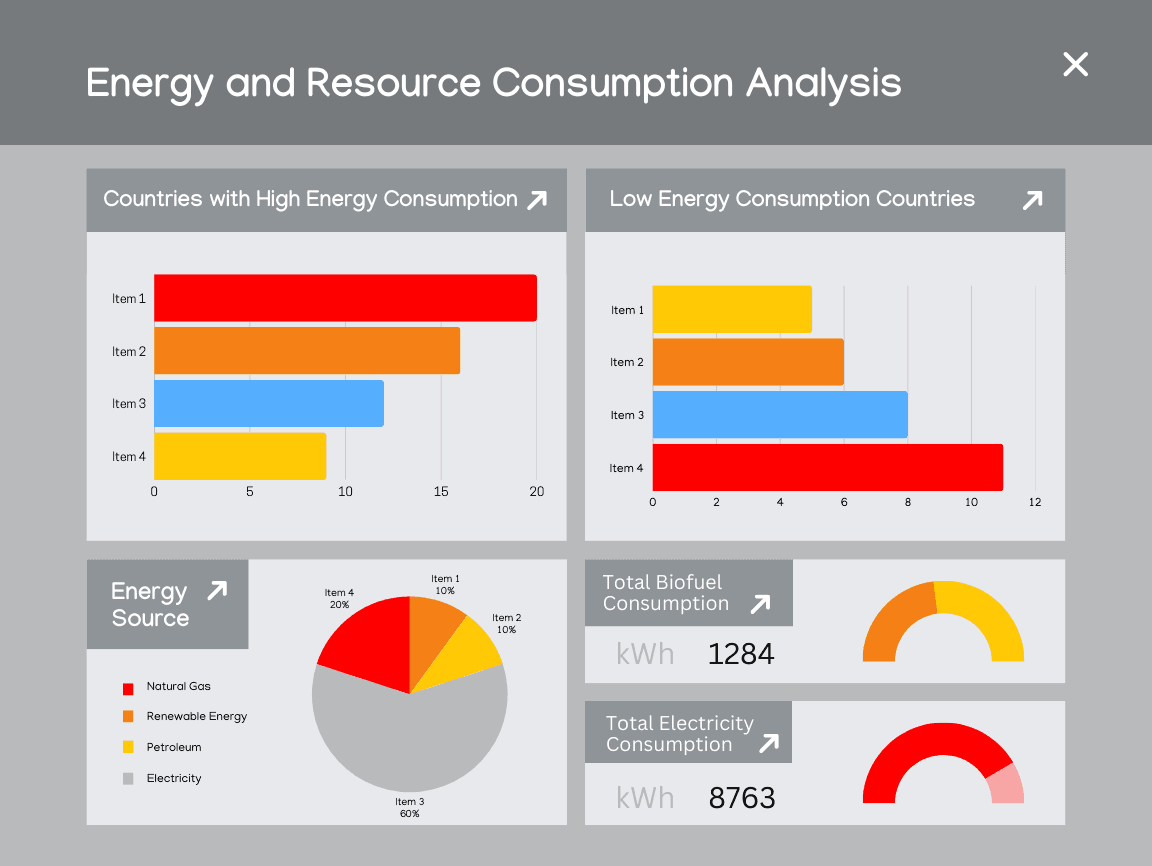
2. Data Visualization Confusion
- Charts lacked consistent scaling and legends
- Metric prioritization was unclear
- Critical insights were visually competing with secondary data
3. Silent UX Bugs
- Filters appeared applied but were not consistently reflected
- State changes were not clearly communicated
- Some actions succeeded technically but felt broken to users
These issues did not generate error logs — but they eroded trust and confidence over time.
Recommendations
We provided clear, actionable recommendations, including:
- Re-structuring dashboard navigation hierarchy
- Improving visual contrast and spacing for key metrics
- Standardizing interaction patterns across modules
- Clarifying system feedback for user actions
- Reducing unnecessary cognitive steps in frequent workflows
Each recommendation was prioritized by impact vs effort.
Outcome
After implementing the recommended changes:
- Dashboard usability became noticeably smoother
- Users could locate key insights faster
- Reduced confusion during first-time usage
- Improved clarity without changing core functionality
The product felt more intentional, predictable, and confident — without a full redesign.
Why This Audit Mattered
This case demonstrated a common pattern we see in mature SaaS products:
“The system works — but the experience quietly works against the user.”
By addressing silent UX friction early, the team avoided larger usability debt and improved long-term product trust.
Engagement Type
One-time UX & Bug Audit
Delivery
- Structured PDF report
- Annotated findings
- Clear fix recommendations
- 3–5 day turnaround
Want similar clarity for your product?
Uncover what’s silently holding your users back.